Tags

Branding
+
Webflow
+
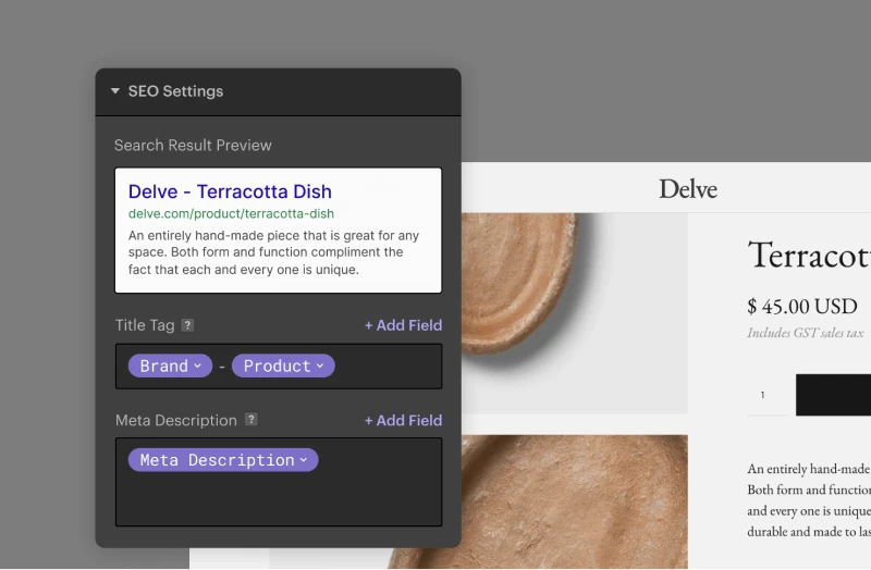
SEO
Creation of an identity for a SaaS in the employability of young people
Challenge
Grimp asked us to take the next step. The objective was to create a strong brand that stands out from the competition with an environment that promotes inclusion and diversity in visual rendering. The deadline was very short since the site had to be ready for the announcement of the fundraiser (1M€).

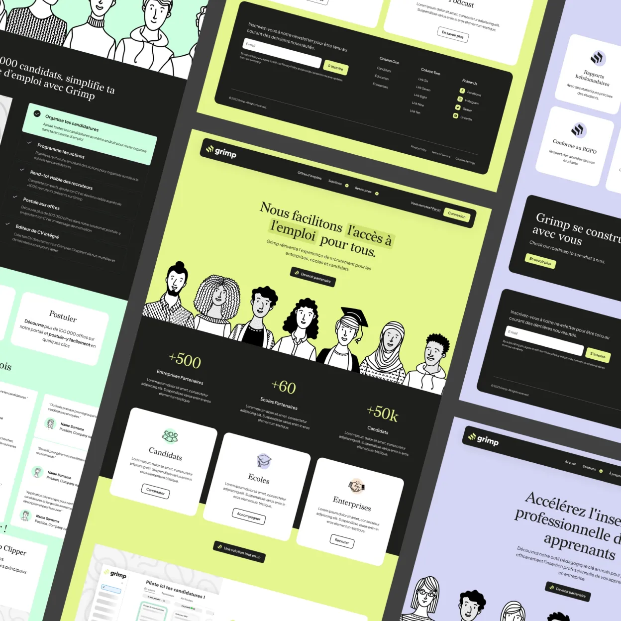
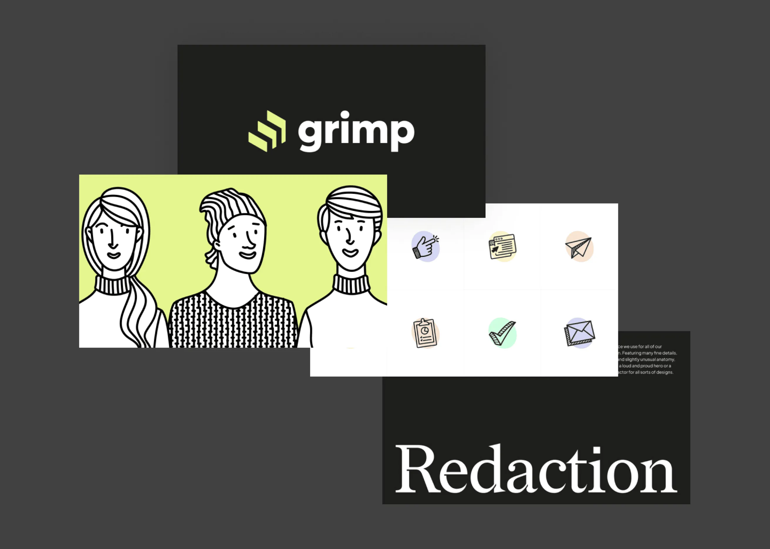
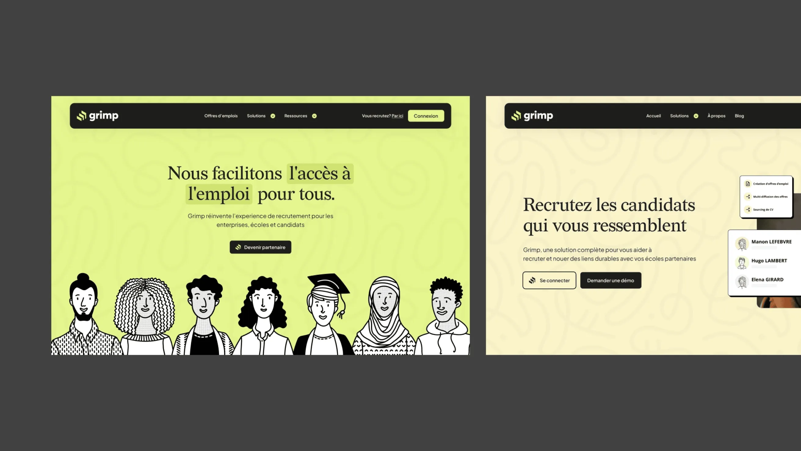
Branding
Our choice was for pastel colors, very light, with avatars to personify Grimp's branding. The idea is to play with colors according to the targets (candidates, schools, companies), and to standardize everything with Grimp's main color.

Web Design
Rich and simple at the same time, the Grimp solution is an evangelizer in its market. This position implies providing more complete answers and going further in the provision of information. We created a whole set of pages to be as accessible as possible to different audiences.
Webflow
Grimp used Webflow before this mission (we actually used a theme provided by themselves at the very beginning to help them). However, we made the choice to take a new base to start again in the best way and have optimal performances.
+178%
Site traffic
Traffic has increased significantly thanks to Grimp's reputation and the SEO actions carried out.
+260%
Conversions
Thanks to the optimization of the site's UX, we have strengthened confidence in the solution.
+680%
Keywords
Over 40 pieces of content have been published on the blog over the past few months, and the impact is more noticeable.
Prenons 30 minutes pour échanger et collaborer en bonne intelligence.