Creation of an identity for a health training platform
.png)
.png)
Challenge
The objective of the project was to reach a new level for the Learnylib brand. However, it was necessary to succeed in designing a simple and accessible interface for regulars while providing a layer of innovation in order to elevate the discourse.
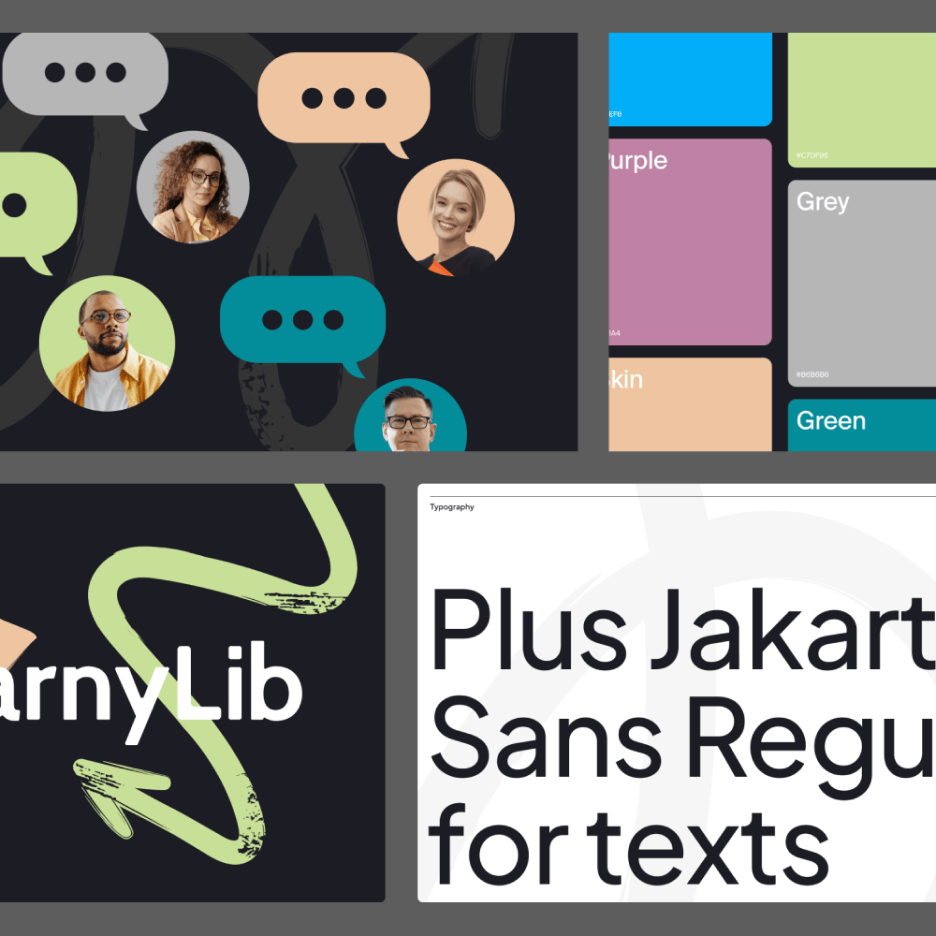
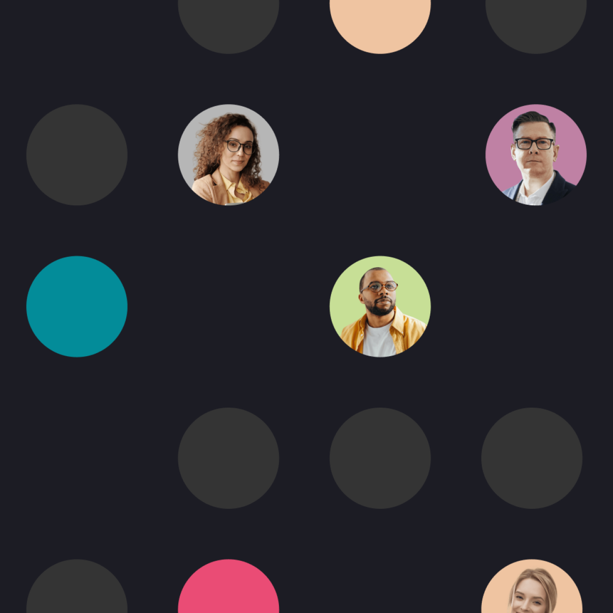
Branding
We focused on people for this redesign, it was essential to feel close to the teams and trainers at each stage of the user journey. Learnylib is aimed at 6 actors in the health field, each is represented by a color that can be found in different places on the site.
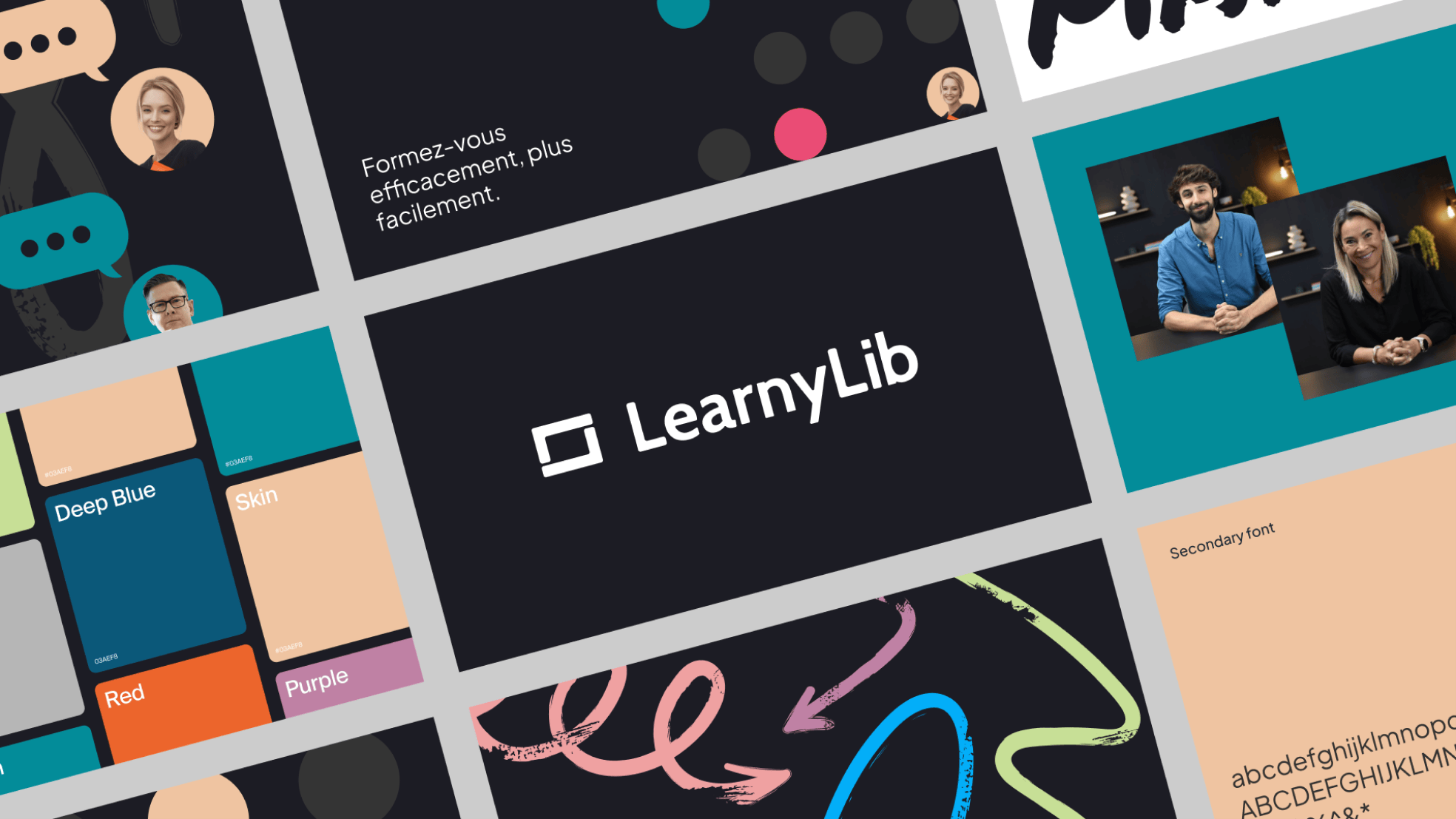
Web Design
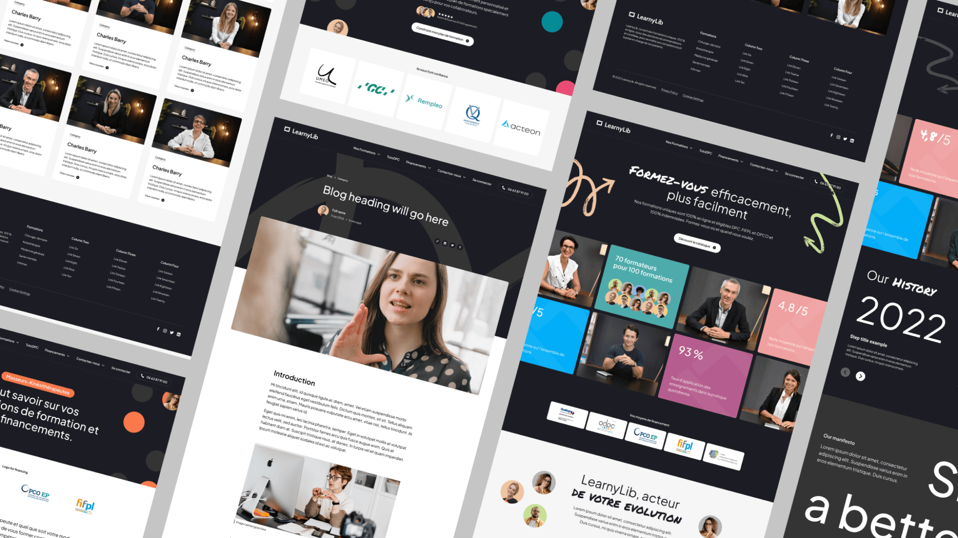
We designed around 20 page templates to present all the different content of Learnylib (articles, guides, training, resources, podcasts, etc.). The graphic style is colorful, rounded, animated, dynamic, human to bring freshness to medical training.
Webflow
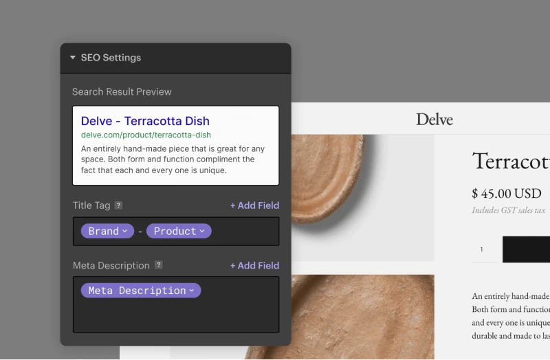
The migration from WordPress to Webflow went very well since we did not lose any position, the site stands out better in Google, it is faster by +30%, and the teams are now autonomous to manage the content and pages that are accessible.
Site SEO score
A long work has been done on the site, which contains +390 pages, an increase of 24%.
Conversions
Implementation of new conversions in the site (resources, guides, appointments, etc.) to increase the conversion rate
Traffic value
The value of traffic corresponds to the number of clicks with an interesting CPC, an increase of 32% in 3 months.
Prenons 30 minutes pour échanger et collaborer en bonne intelligence.


